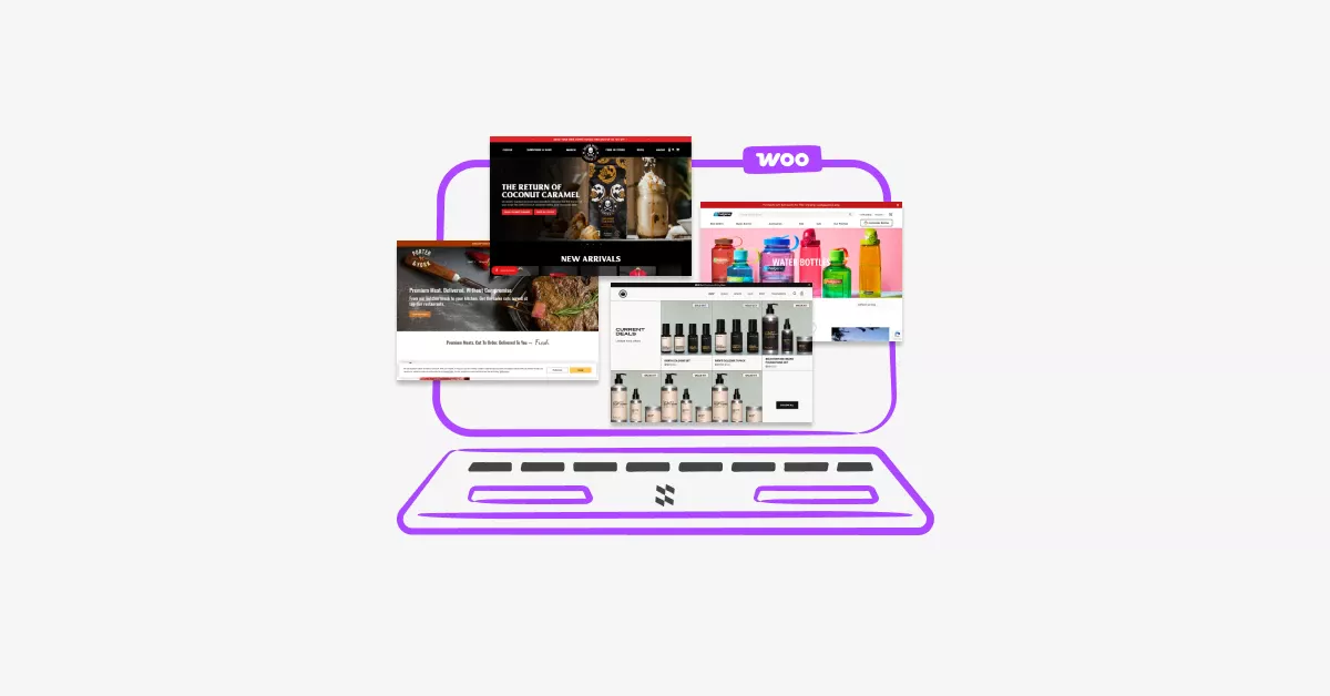
Introduction
If you’re looking for the best WooCommerce website examples to inspire your next store design, you’re in the right place. In this guide, we showcase the best WooCommerce website examples that demonstrate powerful design, smooth navigation, and high-converting layouts. These WooCommerce website design examples will help you understand what works, why it works, and how you can apply the same strategies to your own store.
Ever scrolled through a WooCommerce store and thought, “Wow, I wish my shop looked like this”?
You’re not alone. Design matters more than you might think. A beautiful, well-organized storefront doesn’t just look nice it actually helps you sell more products.
The problem? Most store owners don’t know where to start. You might be great at what you sell, but design feels overwhelming. Should you focus on colors? Navigation? Product pages?
Here’s the good news: you don’t need to reinvent the wheel. Some WooCommerce websites have already nailed it. By studying what they do right, you can borrow proven ideas and apply them to your own shop.
In this post, I’ll show you five outstanding WooCommerce website examples across different industries. You’ll see exactly what makes each one work and walk away with actionable ideas you can use today.
Table Of Contents
Why Great Design Actually Impacts Your Sales
Let’s talk about something important: your WooCommerce website design directly affects your bottom line.
Think about it. When someone lands on your store, you have about 3 seconds to make a good impression. That’s it. If your site looks outdated, cluttered, or confusing, they’ll hit the back button faster than you can say “add to cart.”
According to research from Stanford University, 75% of users admit to making judgments about a company’s credibility based on their website design. That means three out of four potential customers are deciding whether to trust you based purely on how your site looks.
But here’s what really hurts: a study by Adobe found that 38% of people will stop engaging with a website if the content or layout is unattractive. You could have the best products in the world, but if your design pushes people away, you’ll never get the chance to prove it.
It’s frustrating when you put so much effort into sourcing products, writing descriptions, and setting up shipping only to lose sales because your storefront doesn’t inspire confidence.
The truth is, design isn’t just about looking pretty. It’s about creating trust, making shopping easy, and guiding customers smoothly from browsing to buying. When you get it right, everything else gets easier.
What Makes a WooCommerce Store Design Actually Work
Before we dive into the examples, let’s cover what separates great WooCommerce website design from mediocre ones.
Clear Navigation and Easy Product Discovery
Your customers should never feel lost. Good navigation means they can find what they need in two or three clicks. Use clear category names, logical menu structures, and a prominent search bar.
Think about organizing your products in a way that makes sense to shoppers, not just to you. If someone wants “running shoes,” they shouldn’t have to click through “footwear → athletic → road sports → running.”
Fast Loading Speed
Nobody waits around for slow WooCommerce websites anymore. If your pages take more than three seconds to load, you’re losing money. Optimize your images, choose quality hosting, and keep your design clean.
Mobile-Friendly Design
More than half of online shopping happens on phones now. Your store needs to look just as good on a smartphone as it does on a desktop. Buttons should be easy to tap, text should be readable without zooming, and checkout should work smoothly.
Smart Product Page Organization
Product pages are where the magic happens. Great stores organize information clearly with high-quality images, detailed but scannable descriptions, visible pricing, and easy-to-find add-to-cart buttons.
Using tools like Product Tabs for WooCommerce can help you organize product information into clean, clickable sections. Instead of overwhelming customers with one giant wall of text, you can separate specs, reviews, shipping info, and FAQs into organized tabs.
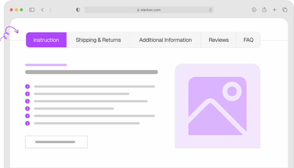
Product Tabs for WooCommerce
Consistent Branding Throughout
Your colors, fonts, and style should feel cohesive from your homepage to your checkout page. This builds trust and makes you look professional. Pick 2-3 main colors and stick with them. Choose readable fonts. Use the same button styles everywhere.
Now let’s look at five stores that put these principles into action.
Example 1: Porter & York – Premium Meat Delivery Done Right
Porter & York sells high-quality meat and seafood online, and their WooCommerce website store is absolutely beautiful.
What They Do Well:
Their homepage immediately establishes trust with professional photography that makes you hungry just looking at it. Every product shot is crisp, well-lit, and shows exactly what you’re getting.
Navigation is dead simple. They organize products by type (beef, pork, seafood) and by occasion (grilling, holidays). You can find what you need in seconds.
Their product pages are exceptionally clean. Each one includes detailed descriptions, cooking tips, and nutritional information all organized so it doesn’t overwhelm you. The checkout process is streamlined with minimal steps.
What You Can Learn:
Invest in quality product photography. If Porter & York can make raw meat look appealing through good photos, you can make your products shine too. You don’t need expensive equipment good lighting and a clean background go a long way.
Organize your products by how customers actually shop, not just by category. Think about use cases and occasions.
Use your product pages to educate, not just sell. When you help customers understand what they’re buying and how to use it, they feel more confident clicking “buy now.”
Example 2: Nalgene – Functional Product Pages With Clear CTAs
Nalgene, the famous water bottle brand, runs their online store on WooCommerce. Their approach is refreshingly straightforward.
What They Do Well:
Their site prioritizes function over flashy design. Everything loads fast, navigation is intuitive, and the product filtering works perfectly. You can sort by size, color, or collection in one click.
Product pages include lifestyle images showing bottles in use, detailed specifications, and a prominent “Add to Cart” button that’s hard to miss. They also show which products are popular or trending, creating social proof.
If you want even faster checkout, adding a Quick Buy Now Button for WooCommerce to your product pages can help customers skip the cart and go straight to checkout perfect for stores with impulse-buy products.
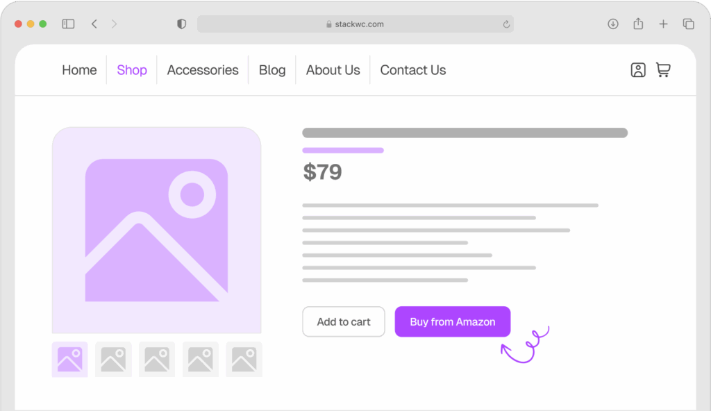
Quick Buy Now Button for WooCommerce
What You Can Learn:
Don’t overcomplicate things. A clean, fast-loading site beats a fancy slow one every time.
Show products in context. Lifestyle photos help customers visualize using your product in their own lives.
Make your call-to-action buttons obvious. Use contrasting colors and clear text like “Add to Cart” or “Buy Now”, never “Learn More” or “Click Here.”
Example 3: Beardbrand – Community-Driven Commerce
Beardbrand sells men’s grooming products, but they’ve built something bigger than a store they’ve built a community.
What They Do Well:
Their design reflects their brand personality perfectly. Masculine colors, bold typography, and lifestyle photography that tells a story. You immediately understand who they are and who they’re for.
They excel at content integration. Their blog, YouTube channel, and products all feel connected. Educational content sits right alongside product pages, helping customers learn while they shop.
The product pages use video extensively. Instead of just reading about a product, you can watch how to use it. This builds trust and reduces returns.
Their WooCommerce website hours and special promotions are clearly communicated. If you need to manage business hours, special events, or limited-time offers, Open Close Store for WooCommerce lets you automate schedules, add countdown timers, and control when customers can place orders, all without touching code.
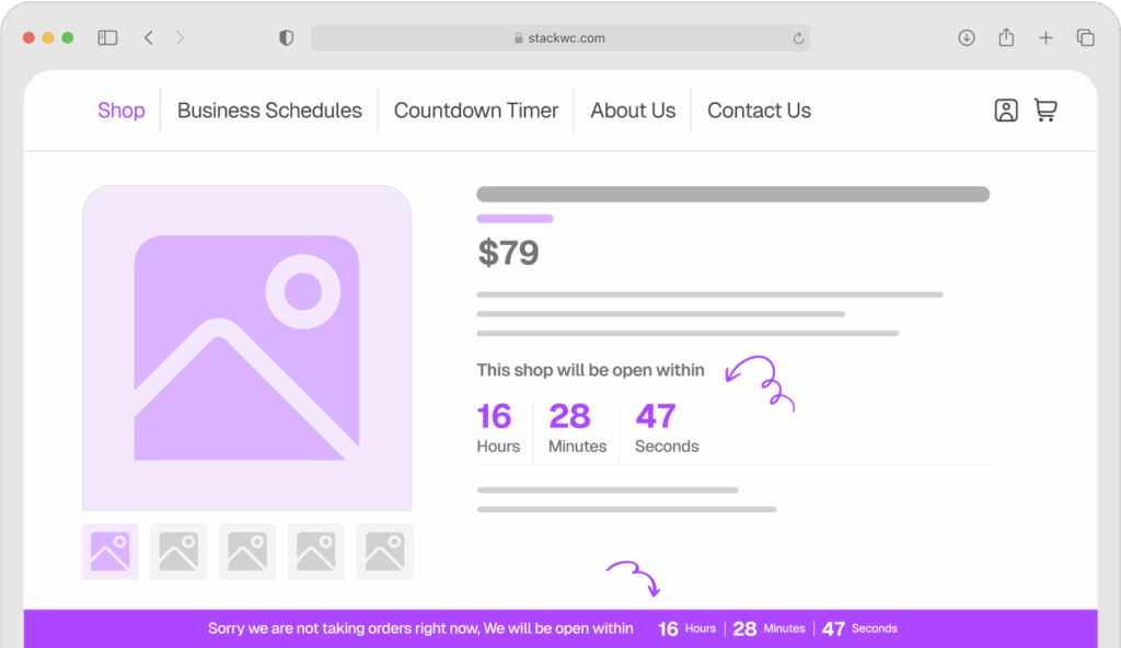
Open Close Store for WooCommerce
What You Can Learn:
Let your brand personality show in your design. Don’t be afraid to make bold choices that appeal to your specific audience even if it means not appealing to everyone.
Mix content with commerce. Educational posts, how-to guides, and product pages can work together to build trust and authority.
Consider adding video to product pages. Even simple videos shot on your phone can help customers understand your products better than paragraphs of text.
Example 4: Bluestone Perennials – Clarity for Complex Catalogs
Bluestone Perennials sells plants and gardening supplies. They have thousands of products, but their WooCommerce website store never feels overwhelming.
What They Do Well:
Their search and filtering system is exceptional. You can filter plants by sun requirements, bloom time, height, and color. This turns a potentially confusing catalog into an easy shopping experience.
Product pages include detailed growing information, care instructions, and realistic photos showing what the plant looks like at different stages. They set clear expectations.
They use seasonal banners to highlight what’s relevant right now. Instead of showing everything at once, they guide you to what makes sense for the current season.
What You Can Learn:
If you have lots of products, invest time in creating powerful filters. Make it easy for customers to narrow down options based on what matters to them.
Set realistic expectations with your product photos and descriptions. Show products as they actually are, not idealized versions that lead to disappointment.
Use timely promotions and banners to highlight what’s relevant now. This reduces decision fatigue and guides customers to what they probably want anyway.
Example 5: Death Wish Coffee – Bold Branding That Converts
Death Wish Coffee has one of the most distinctive WooCommerce website stores you’ll find. Their branding is aggressive, memorable, and perfectly aligned with their product (the world’s strongest coffee).
What They Do Well:
Their brand consistency is flawless. From the skull logo to the dark color scheme to the bold copy, everything reinforces who they are. You’ll never confuse them with another coffee brand.
The homepage funnels you efficiently to products with minimal distraction. They don’t overcomplicate things with dozens of options they focus on their core offerings.
Customer reviews are prominently displayed on every product page. Real feedback builds trust faster than any marketing copy you could write.
They make urgency work without being pushy. Limited editions and seasonal flavors create natural excitement without feeling like manipulative sales tactics.
If you’re running promotions or time-sensitive offers, staying on top of orders is crucial. Order Notification for WooCommerce gives you real-time audio alerts whenever a new order comes in, so you never miss a sale during busy periods.
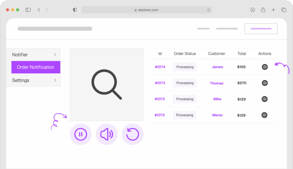
Order Notification for WooCommerce
What You Can Learn:
Commit to your brand identity. Half-hearted branding confuses people. Bold, consistent branding attracts your ideal customers like a magnet.
Simplify your product offerings. Sometimes less is more. Focus on what you do best instead of trying to sell everything to everyone.
Showcase real customer reviews prominently. Social proof matters more than perfect marketing copy.
How to Apply These Ideas to Your Own Store
Feeling inspired? Here’s how to take what you’ve learned and actually implement it.
Step 1: Audit Your Current Design
Open your WooCommerce website in a private browser window (so you see it as a new visitor would). Ask yourself honestly: Does this look professional? Can I find products easily? Does it load quickly on my phone?
Write down three things that feel off or confusing. These are your starting points.
Step 2: Pick One Element to Improve First
Don’t try to redesign everything at once. Pick the biggest problem area. Maybe it’s your product photos, your navigation menu, or your checkout process.
Focus your energy there first. Small improvements add up faster than you think.
Step 3: Improve Your Product Pages
Start with your best-selling products. Update photos, rewrite descriptions to focus on benefits, and organize information clearly.
If your product pages feel cluttered, consider using Product Tabs for WooCommerce to separate details, specs, shipping info, and reviews into clean tabs. This makes pages easier to scan and improves user experience without reducing information.
Step 4: Optimize for Mobile
Pull out your phone and try to buy something from your own store. Where does it feel clunky? What’s hard to tap? What’s difficult to read?
Make notes and fix the biggest mobile issues. With over 50% of traffic coming from phones, this isn’t optional anymore.
Step 5: Speed Up Your Site
Run your site through Google Page Speed Insights. It’ll tell you exactly what’s slowing you down. Common fixes include compressing images, choosing better hosting, and removing unused plugins.
Step 6: Test and Refine
After making changes, watch your analytics. Are people staying on your site longer? Are they viewing more pages? Is your conversion rate improving?
Design is never “done.” Keep testing, learning, and improving. No coding required for most changes just attention to detail and willingness to make your store better.
Step 7: Get Feedback
Ask friends or customers to browse your store and tell you what they think. Fresh eyes catch things you’ve stopped noticing.
You can also use tools like Hotjar to see how real visitors interact with your site. Where do they click? Where do they get stuck?
Ready to create a better shopping experience? Start with one improvement this week. You don’t need a complete redesign just consistent progress.
Common Questions About WooCommerce Store Design
Not necessarily. Many modern WooCommerce themes are beautifully designed out of the box. Start with a quality theme like Astra, Kadence, or GeneratePress. These give you professional results without custom design work. As you grow, you can invest in custom design if needed.
Your product pages. That’s where buying decisions happen. A beautiful homepage is nice, but if your product pages don’t convert, nothing else matters. Focus your energy there first.
Track your metrics before and after changes. Look at conversion rate, bounce rate, time on site, and pages per session. Use Google Analytics or your WooCommerce built-in reports. Real data beats opinions every time.
No. Get inspired by what works, but make it your own. Your brand, products, and customers are unique. Take the principles (clear navigation, quality photos, organized information) and apply them in your own style. Authenticity matters more than copying.
Conclusion
Great WooCommerce design isn’t about fancy graphics or trendy effects. It’s about making shopping easy, building trust, and helping customers find what they need.
The five stores we looked at prove this. Porter & York uses stunning photography. Nalgene keeps things simple and functional. Beardbrand builds community. Bluestone Perennials organizes complexity. Death Wish Coffee commits to bold branding.
Each approach is different, but they all share common traits: fast loading, mobile-friendly design, clear navigation, quality product pages, and consistent branding.
Here’s your action step: pick one element from these examples that resonates with you. Maybe it’s improving your product photography, reorganizing your navigation, or adding customer reviews more prominently. Start there. Make that one change this week.
You don’t need to rebuild your entire store overnight. Small, focused improvements compound into significant results over time.
Ready to create a store design that actually converts? Try Product Tabs for WooCommerce to organize your product information like the pros do. Clean tabs, better user experience, higher conversions all with a 14-day money-back guarantee. No risk, fully supported, no coding needed.
Your store deserves design that works as hard as you do. Start improving it today.